Strategy, Creativity & Execution
My work brings together strategic thinking, creative problem-solving, communication, and project coordination. Across different projects and disciplines, I focus on understanding objectives, building productive relationships, connecting ideas with practical needs, and bringing people and resources together to move work forward.
The projects featured here demonstrate these capabilities through brand development and visual storytelling, offering insight into how I approach challenges, communicate ideas, and translate objectives into cohesive creative outcomes.
-
Strong work begins with understanding the people, needs, and circumstances behind it. I take the time to listen, ask questions, and identify what matters most to clients, collaborators, and audiences. By understanding the objectives, expectations, and challenges involved, I can recognize what a project needs to accomplish and where the most meaningful opportunities lie.
-
Understanding the objective is only the beginning. I bring together information, perspectives, and creative ideas to identify connections, evaluate possibilities, and develop practical solutions. Whether refining a brand's direction, navigating project constraints, or identifying opportunities for improvement, I approach challenges with curiosity, adaptability, and an eye toward the larger objective.
-
Ideas only become meaningful when they're effectively communicated and carried through. I bring people, resources, and moving parts together, translating direction into clear priorities and actionable work. Through thoughtful communication, coordination, and attention to detail, I help maintain momentum and move projects from initial concept toward successful completion.
Grit City Creative
Finding the story behind the storytellers.
Project
Brand Strategy & Visual Identity
My Role
Lead Consultant & Designer
Scope
Client engagement, discovery facilitation, strategic development, creative direction, and visual design.
Key Deliverables
Two-day discovery workshop, audience profiles, brand positioning, visual identity, and 33-page brand guide.
Project Overview
Grit City Creative was a partnership-run copywriting and communications business based in Tacoma, Washington, helping mission-driven organizations communicate the stories behind their work. Through Lucere Design, I managed the project from initial client engagement through discovery, strategic development, creative execution, and final delivery.
The Challenge
The partners had a clear sense of how they wanted their business to be perceived, but struggled to articulate the story behind their own brand. Although they were experienced in drawing out the stories of their clients, their proximity to their own business made it difficult to recognize what made their own story distinctive.
They needed a way to step back, examine their own perspectives, identify the values and experiences at the heart of their business, and better understand the people they wanted to reach.
The Solution
I developed and facilitated a two-day, in-person discovery workshop, using guided exercises to help the partners examine their business from a new perspective. The work involved drawing out information, identifying common themes, challenging assumptions, and helping them articulate ideas they had struggled to express independently. We also developed ideal customer profiles to clarify the audiences they wanted to reach and serve.
I synthesized those findings into a strategic direction that connected the partners' values and identity with the expectations of their intended audience. The resulting concept gave them a clearer way to communicate what made their business distinctive while remaining authentic to how they wanted to work.
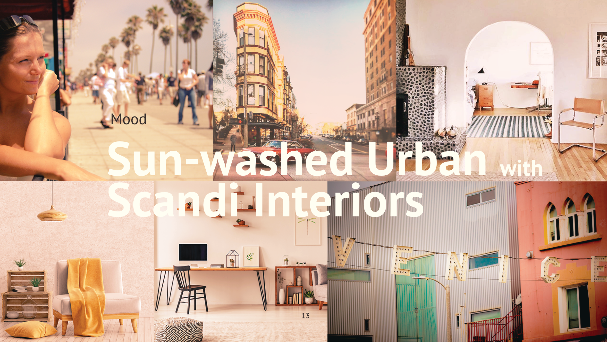
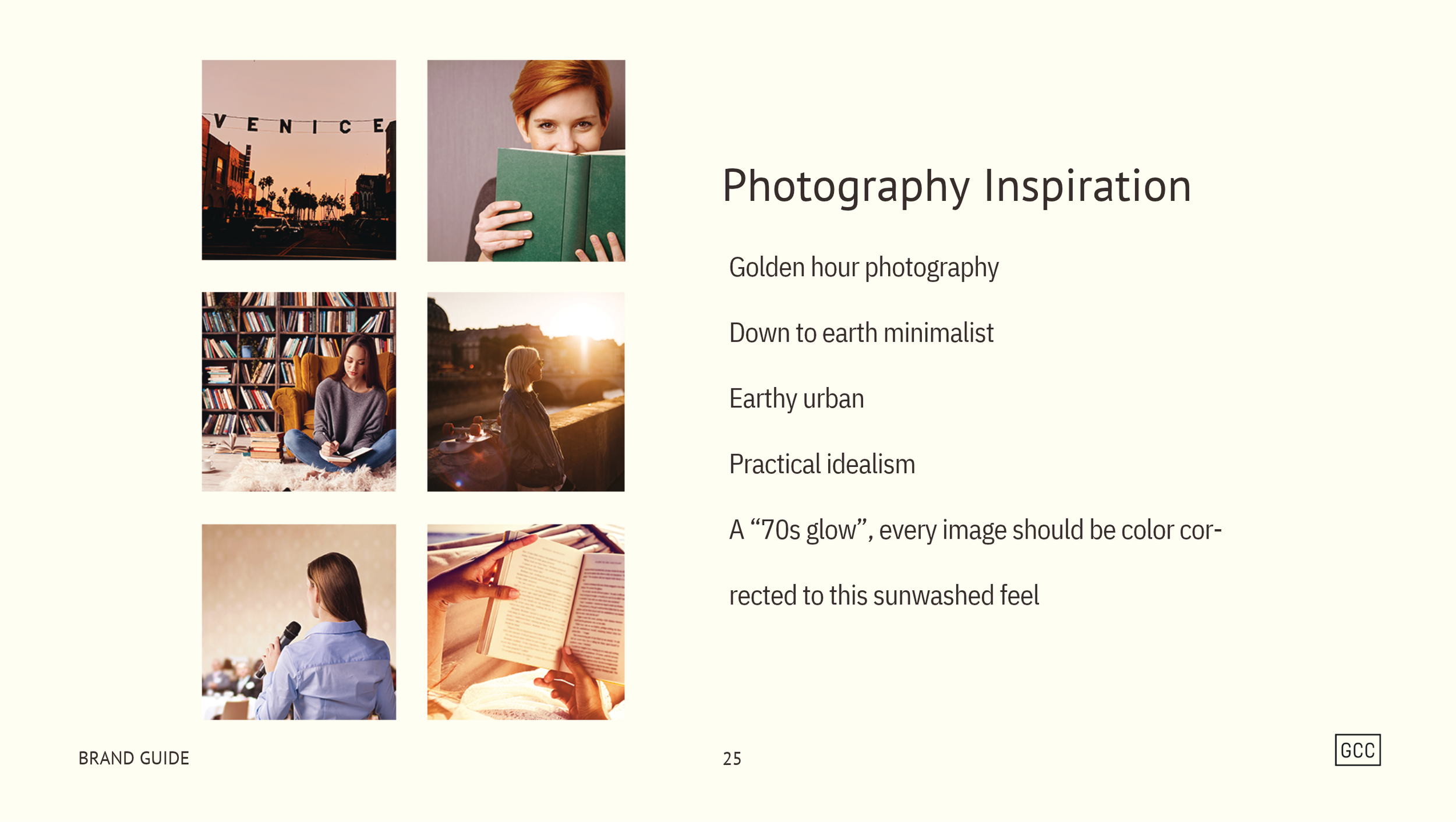
With the central idea, “We put your words to work,” established, I translated the strategy into a cohesive visual identity. I developed the logo, typography, color palette, imagery direction, and supporting graphic elements, then assembled a comprehensive 33-page brand guide to document the decisions and provide a practical reference for future communications and applications.

The supporting imagery shown in this case study consists of conceptual visualizations developed to illustrate how the developed identity could extend into physical materials and the client experience. These are creative explorations, not photographs of completed installations or examples of commissioned applications.
Golden Gaze
An Experience Beyond the Image
Project
Brand Development & Visual Identity
My Role
Brand Strategist & Designer
Scope
Client discovery, customer profiling, creative development, visual direction, and logo design.
Key Deliverables
Brand positioning, customer profiles, custom logo, and visual stylescape.
Project Overview
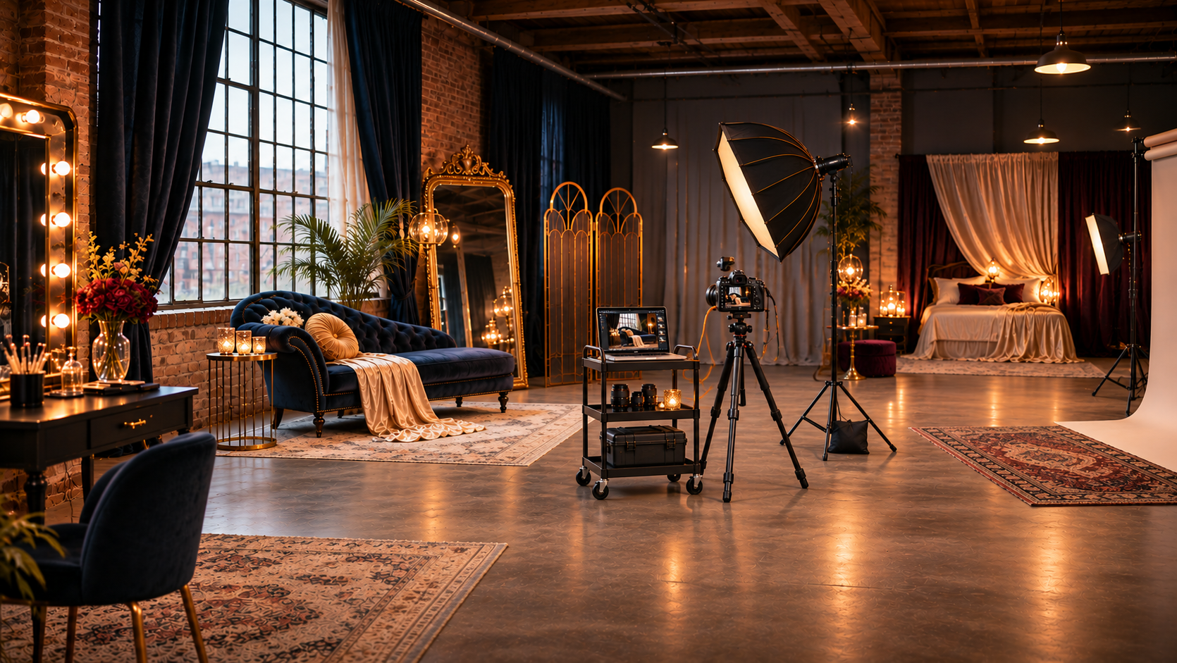
Golden Gaze was a developing boudoir photography brand built around a newly acquired loft studio in downtown Tacoma. The photographer wanted to establish a distinct identity for this next chapter of her business—one that reflected her personal aesthetic while communicating the confidence, intimacy, and luxury she wanted clients to experience.
Through Lucere Design, I worked with the photographer to clarify her vision, understand her intended audience, and translate those insights into a cohesive creative direction. The project brought together client collaboration, strategic positioning, and hands-on visual development to establish a foundation for the brand.
The Challenge
As the photographer moved toward a more specialized boudoir practice, she needed to distinguish her offering in a competitive market. The challenge was understanding what would make the business meaningful to its intended clients and how to communicate that value beyond the photographs themselves.
The experience she envisioned extended beyond the finished images. She wanted clients to feel confident, celebrated, and genuinely cared for throughout the process. The brand needed to connect those aspirations with her own creative sensibilities, the character of her downtown Tacoma loft, and the expectations of the audience she hoped to attract.
The Solution
I began by working with the photographer through a structured discovery process, using guided exercises and customer profiling to clarify her vision and explore what her ideal clients would value. This helped identify an important distinction: the business wasn't simply offering photography, but an experience centered on confidence, self-expression, and personal indulgence.
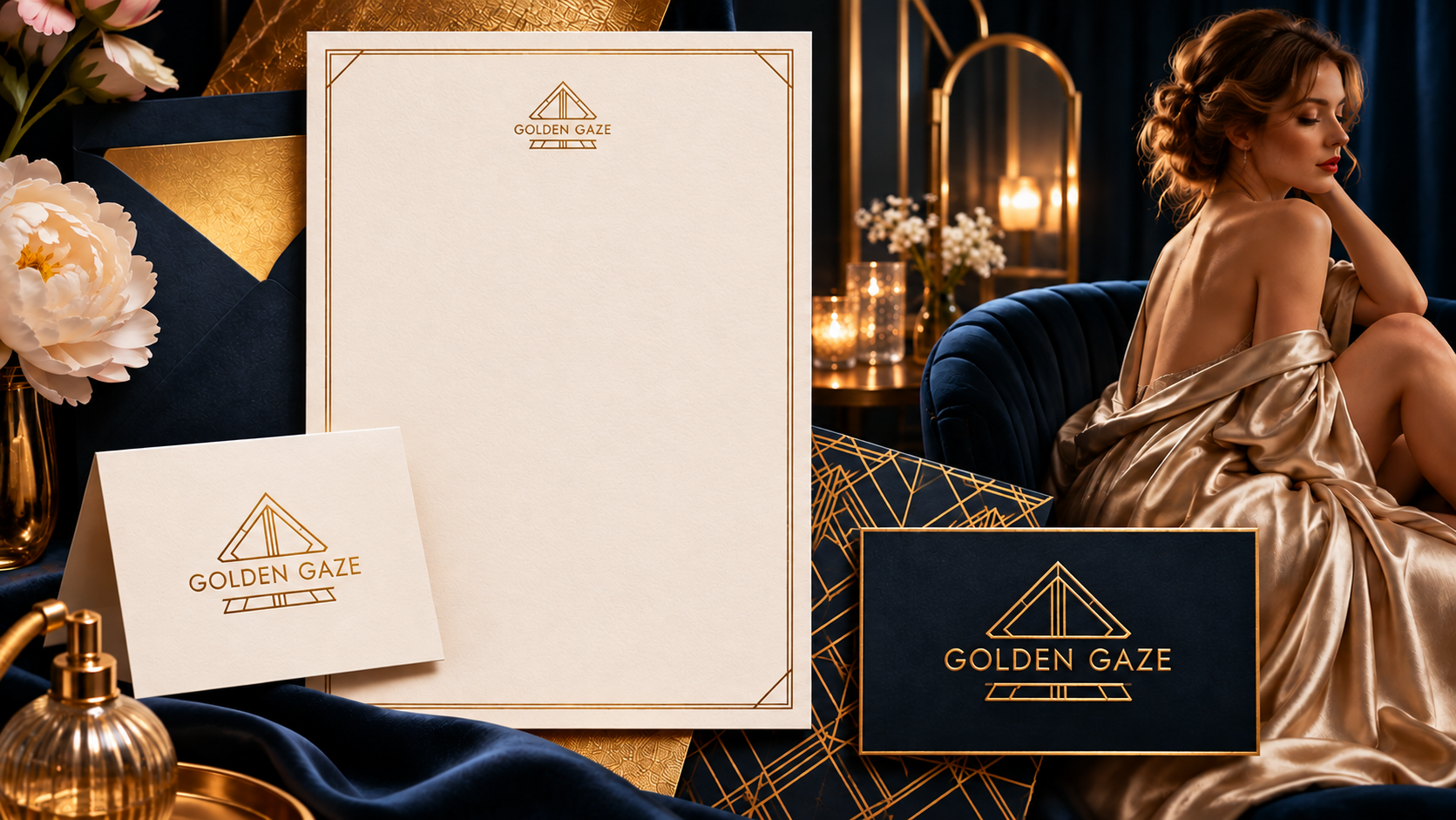
I translated those findings into a creative direction that balanced the photographer's individual aesthetic with the atmosphere she wanted to create for her clients. Through mood-board exploration and several rounds of logo concepts, I developed a custom geometric, Art Deco-inspired emblem that connected the architectural character of downtown Tacoma with the more refined personality of the brand.
With the logo established, I developed a stylescape to bring the direction together across color, typography, and imagery. A rich navy and gold palette, editorial photography references, and architectural influences created a cohesive visual language that could guide the brand's future expression.
The result was a visual foundation that connected the photographer's identity, her physical studio, and the experience she wanted clients to associate with her business.

The supporting imagery shown in this case study consists of conceptual visualizations developed to illustrate how the developed identity could extend into physical materials and the client experience. These are creative explorations, not photographs of completed installations or examples of commissioned applications.
Kraken’s Cup
A World of Stories, Steeped in Whimsy
Project
Concept Development & Visual Identity
My Role
Visual Identity Designer
Scope
Discovery interpretation, creative direction, visual storytelling, and identity development.
Key Deliverables
Custom logo, typography, color palette, illustration, and supporting visual elements.
Project Overview
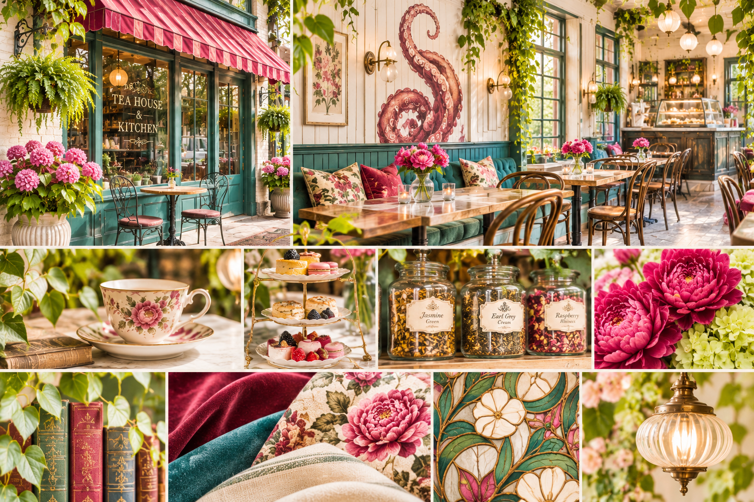
Kraken's Cup was a conceptual tea house envisioned for the Southern United States, designed around the idea of an immersive, literary-inspired gathering place. The concept imagined more than a place to enjoy tea: it was a destination for readers, writers, and kindred spirits to gather, share ideas, spend time with a book, or find inspiration.
Working from the findings of discovery workshops conducted by a colleague, I was responsible for translating the concept's intended atmosphere, personality, and customer experience into a complete visual identity. The project challenged me to take an abstract idea and give it a recognizable visual personality.
The Challenge
Because Kraken's Cup existed at the concept stage, there was no established physical space, customer experience, or operating business to draw upon. The identity had to communicate an experience that existed only as an idea.
The challenge was to interpret the discovery findings and create a visual direction that made the concept feel tangible. It needed to balance the imaginative, literary character of the idea with the warmth and accessibility of a welcoming neighborhood tea house. The result needed to feel distinctive enough to capture attention while giving potential customers an immediate sense of the experience being imagined.
The Solution
I began by reviewing and interpreting the findings from the discovery workshops, identifying the personality, atmosphere, and customer experience they described. From there, I developed an independent creative direction that translated those abstract qualities into a cohesive visual language.
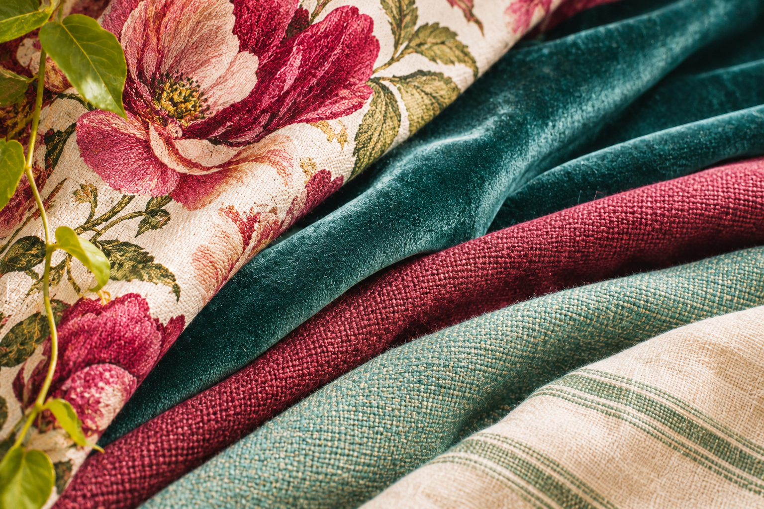
I created the visual identity from the ground up, including an original custom logo, typography, color palette, illustration, and supporting graphic elements. Through the combination of these elements, I built a visual world that drew on literary imagery, playful details, and the familiar warmth of a welcoming gathering place.
The finished identity gave the concept a distinct personality and made its intended experience easier to imagine and communicate. It demonstrated how research and ideas developed by others could be interpreted, synthesized, and translated into a tangible creative outcome.

The supporting imagery shown in this case study consists of conceptual visualizations developed to illustrate how the developed identity could extend into physical materials and the client experience. These are creative explorations, not photographs of completed installations or examples of commissioned applications.